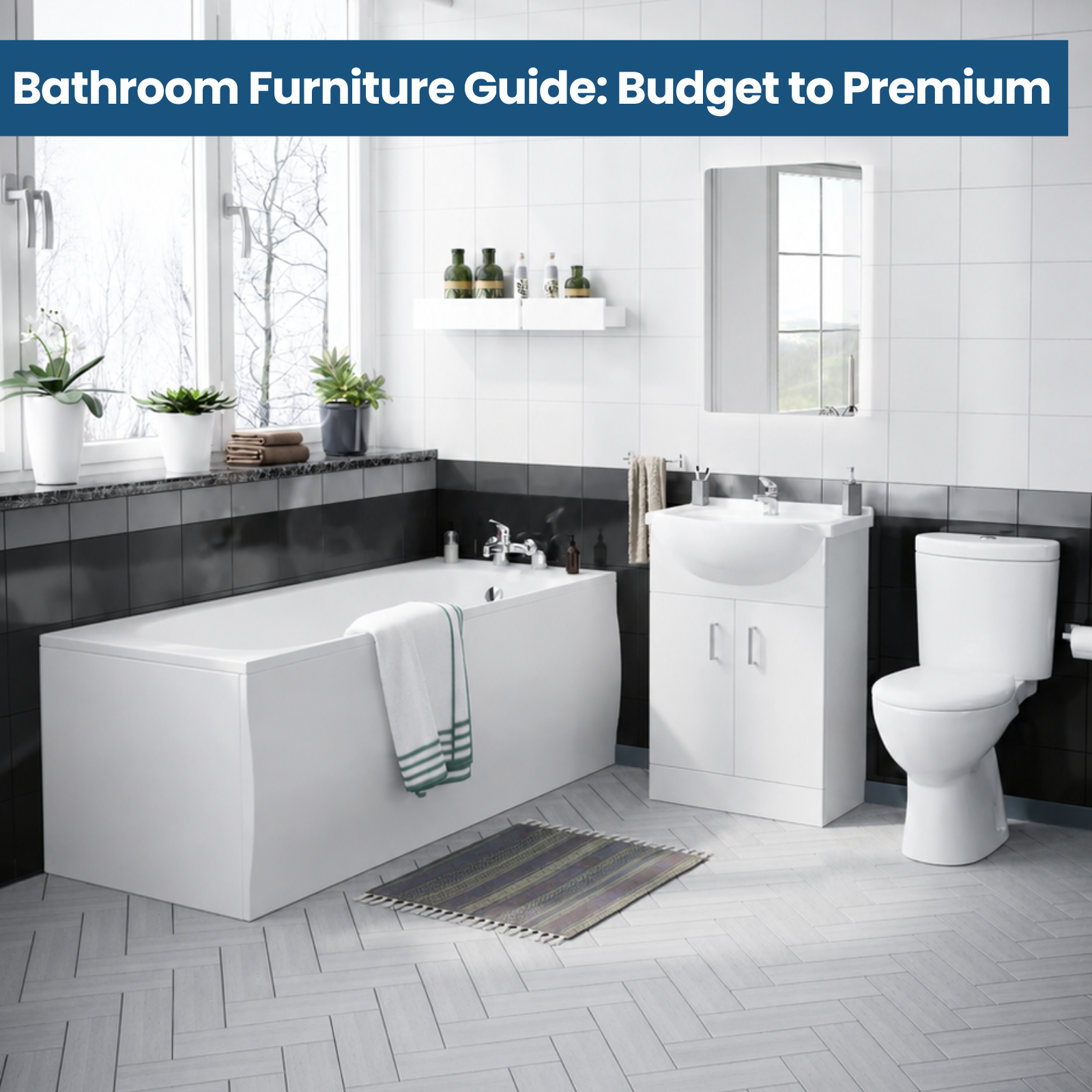
Match Your Taps and Fixtures to Your Style - Find Your Dream Colour Scheme
Coordinating the colours of your taps and bathroom accessories is a crucial aspect of creating a harmonious and visually appealing space. A cohesive colour scheme can transform a bathroom from a mere functional area into a stylish and inviting sanctuary. When the colours complement each other seamlessly, it creates a sense of unity and flow, elevating the overall aesthetic appeal of the room.
Beyond the visual appeal, a well-coordinated colour palette can also influence the ambiance and mood of the space. Warm hues like reds, oranges, and yellows can create a cozy and energetic atmosphere, while cool tones such as blues and greens can evoke a sense of tranquillity and relaxation. By carefully selecting colours that align with the desired ambiance, you can create a bathroom that not only looks beautiful but also feels inviting and tailored to your personal preferences.
Popular Colour Trends for Taps and Accessories
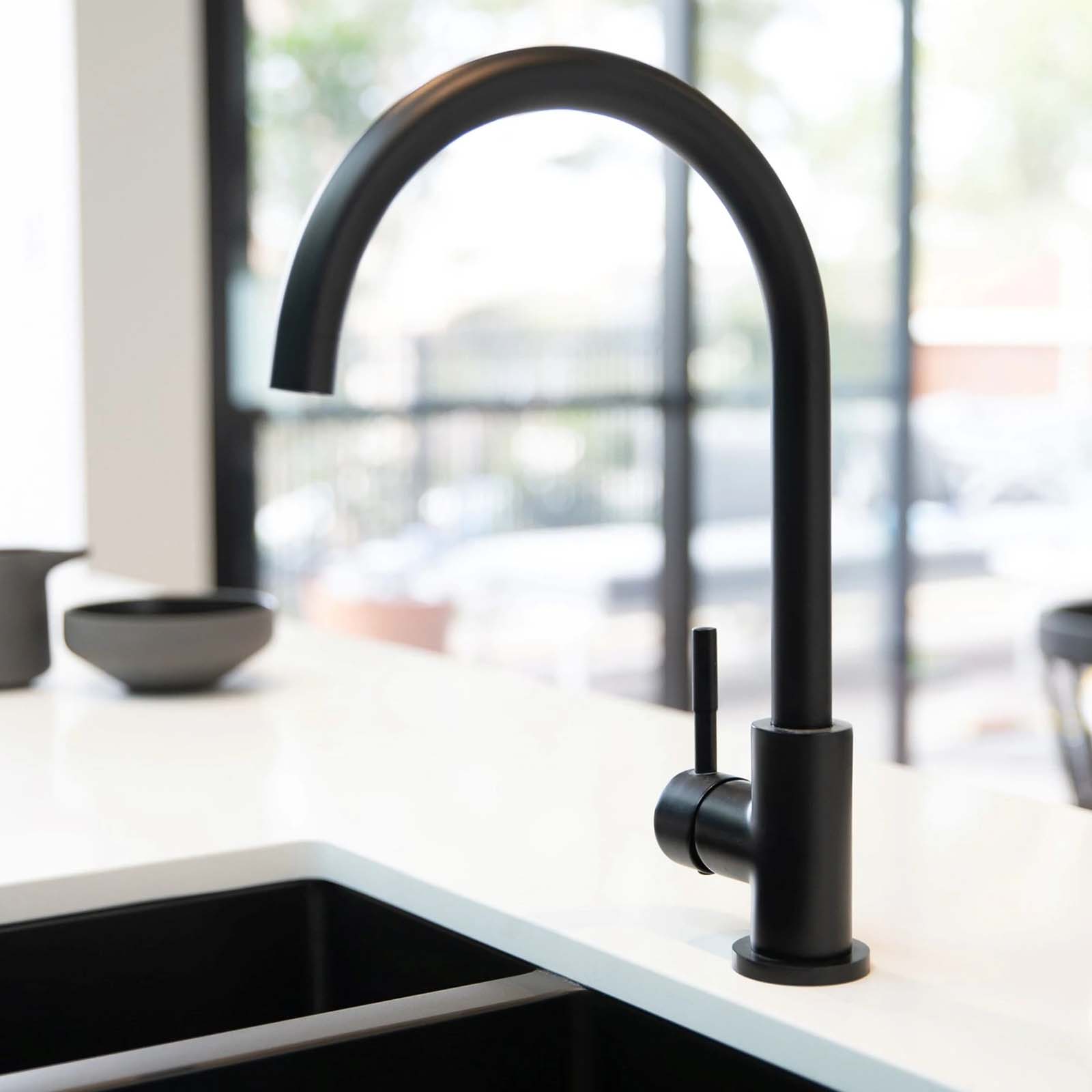
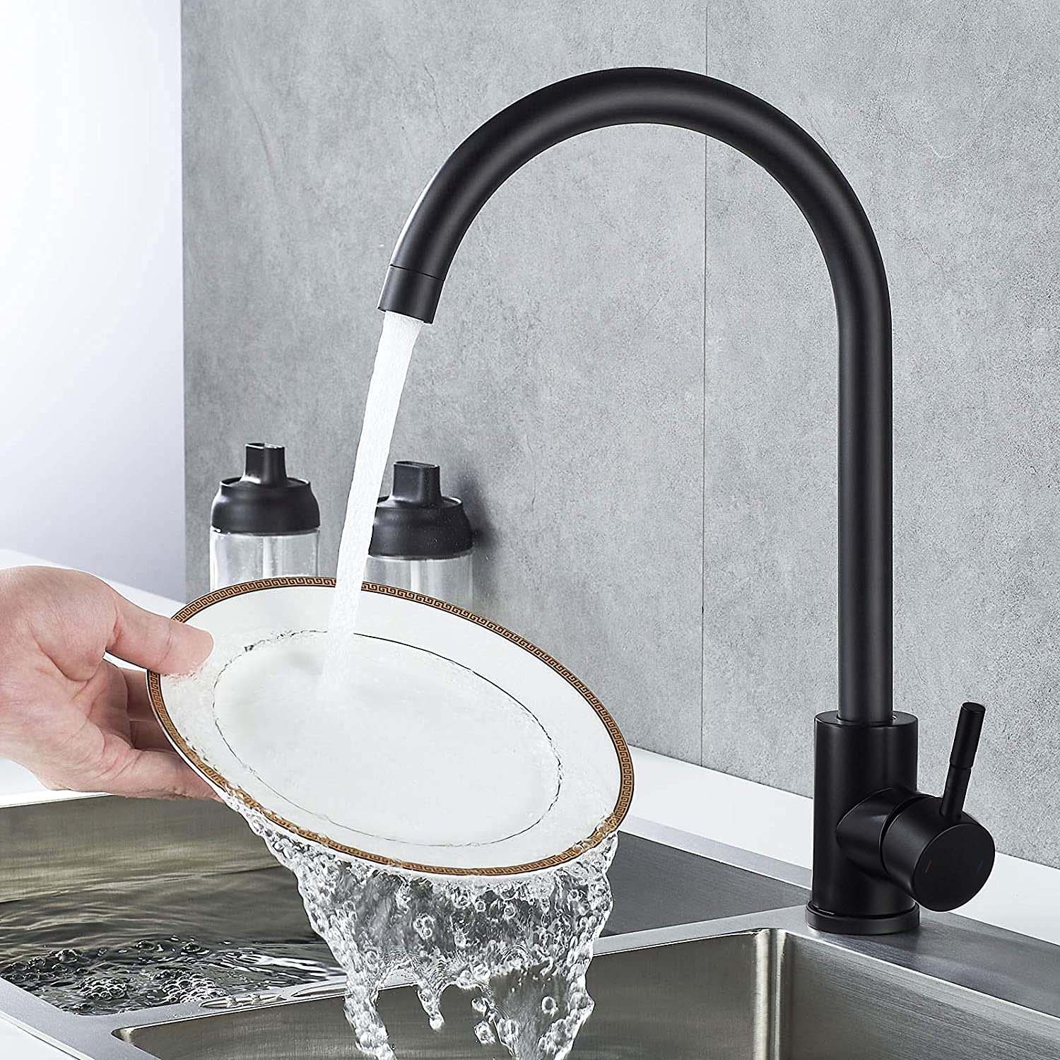
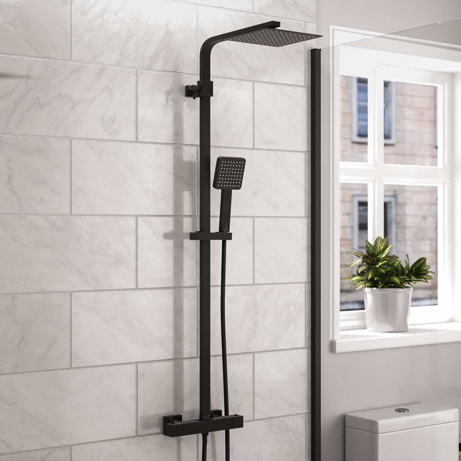
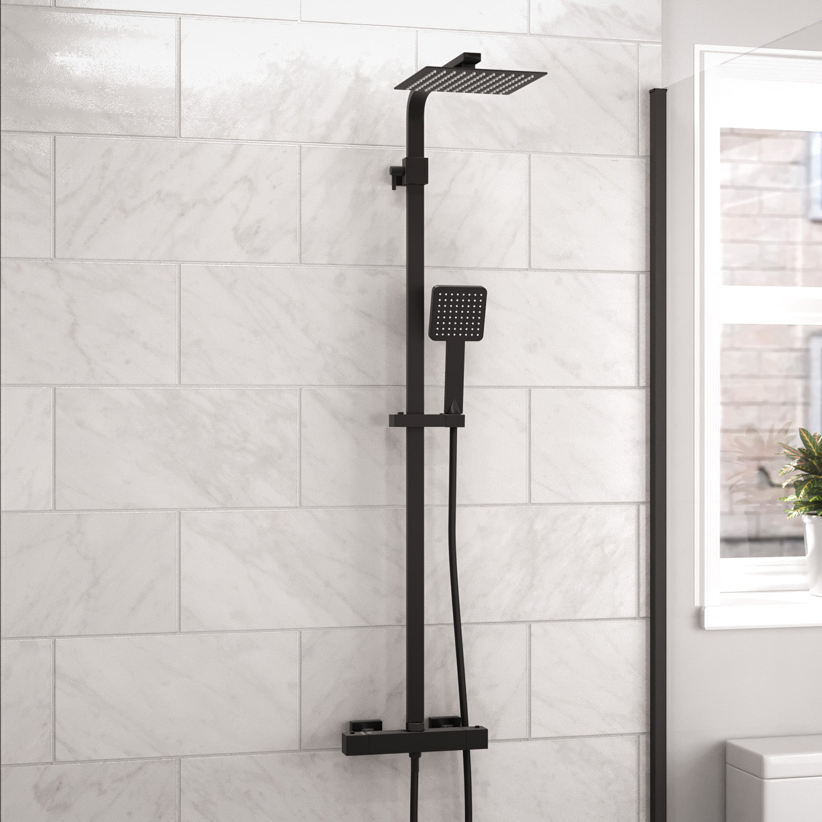
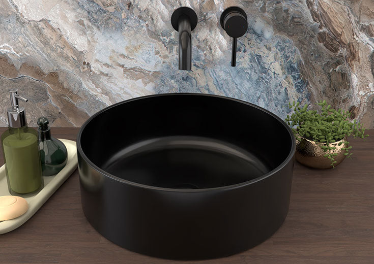
Bathroom taps and accessories have evolved from the traditional chrome and stainless steel finishes to embrace a wide range of trendy colours and finishes. One of the most popular colour trends currently is matte black, which exudes a sleek and modern aesthetic. Matte black bathroom taps, showerheads, and accessories create a bold and dramatic statement, particularly when paired with white or light-coloured bathroom fixtures.

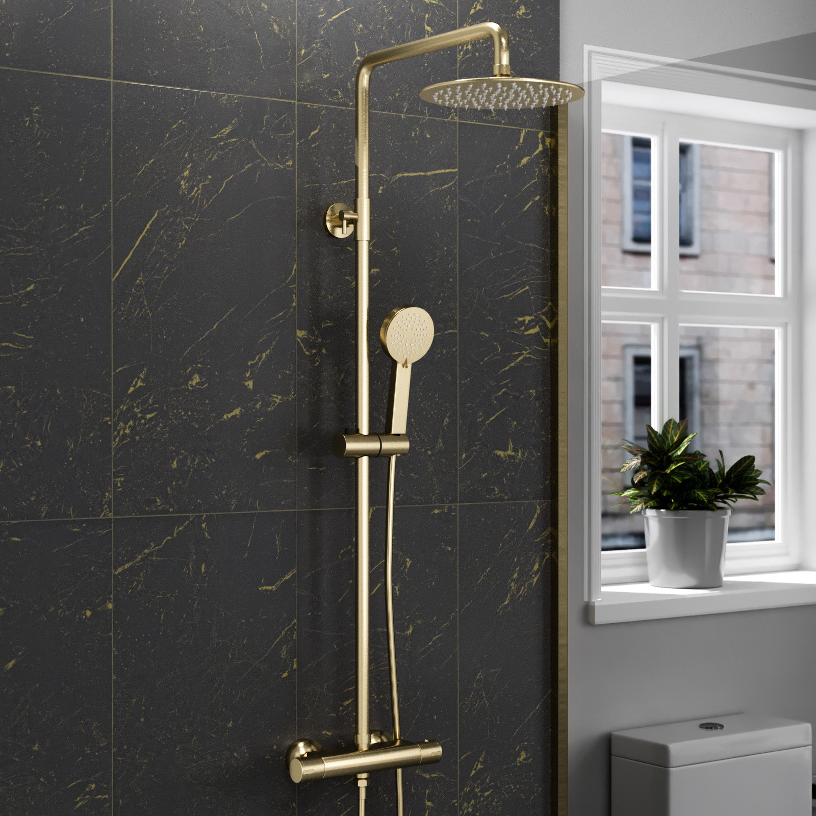
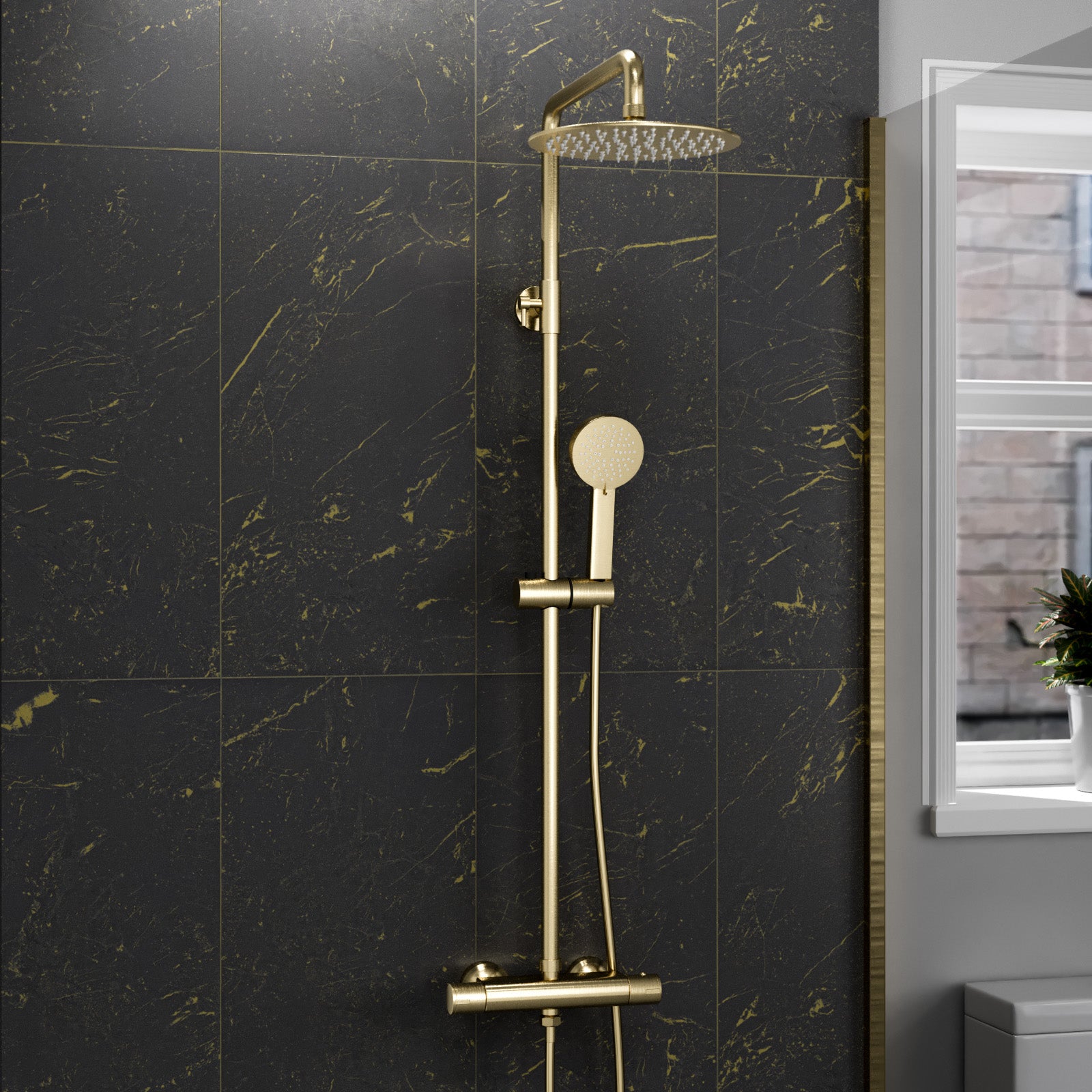
Another trending colour option is brushed brass gold, which adds warmth and elegance to any bathroom. Brushed gold taps and accessories have a soft, muted finish that creates a luxurious and inviting ambiance. This finish pairs beautifully with neutral colour schemes or can be used as an accent against darker tones.
Rustic bathroom designs embrace earthy tones and natural materials, making them well-suited for taps and accessories in warm metallic finishes like copper, brushed gold, or aged brass. These colours can beautifully complement the rugged textures of exposed wood, stone, and distressed finishes commonly found in rustic spaces. Incorporating pops of deep greens or blues can also add a touch of nature-inspired charm.

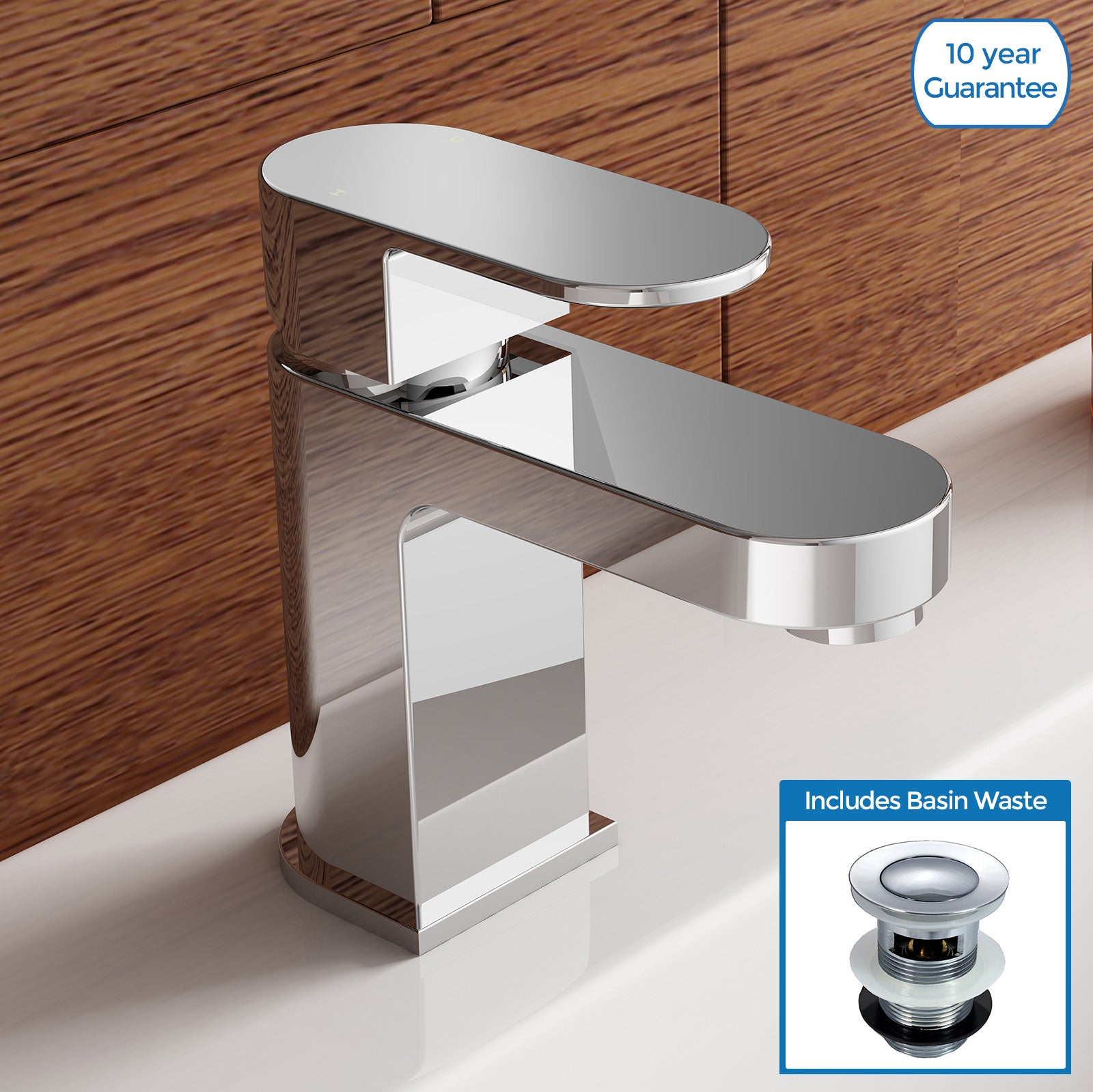
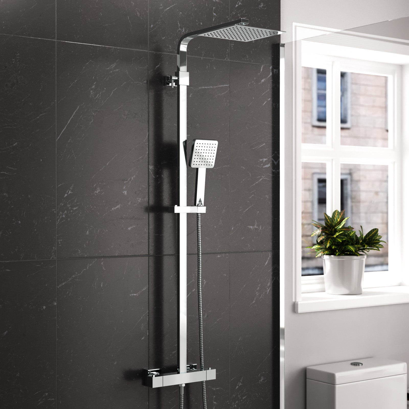
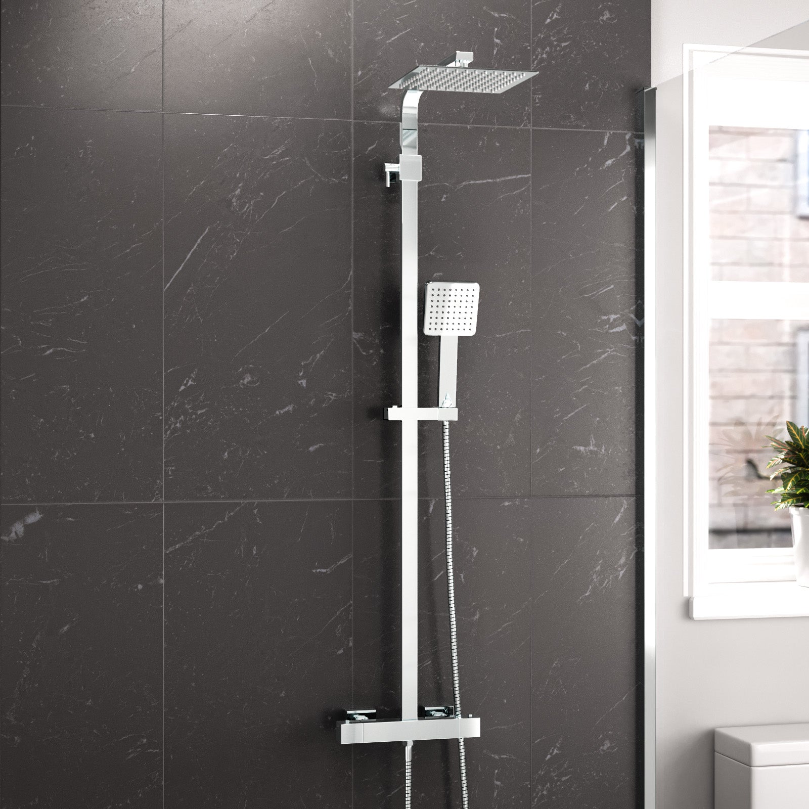
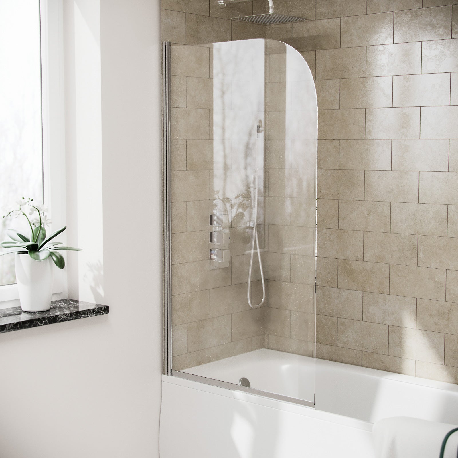
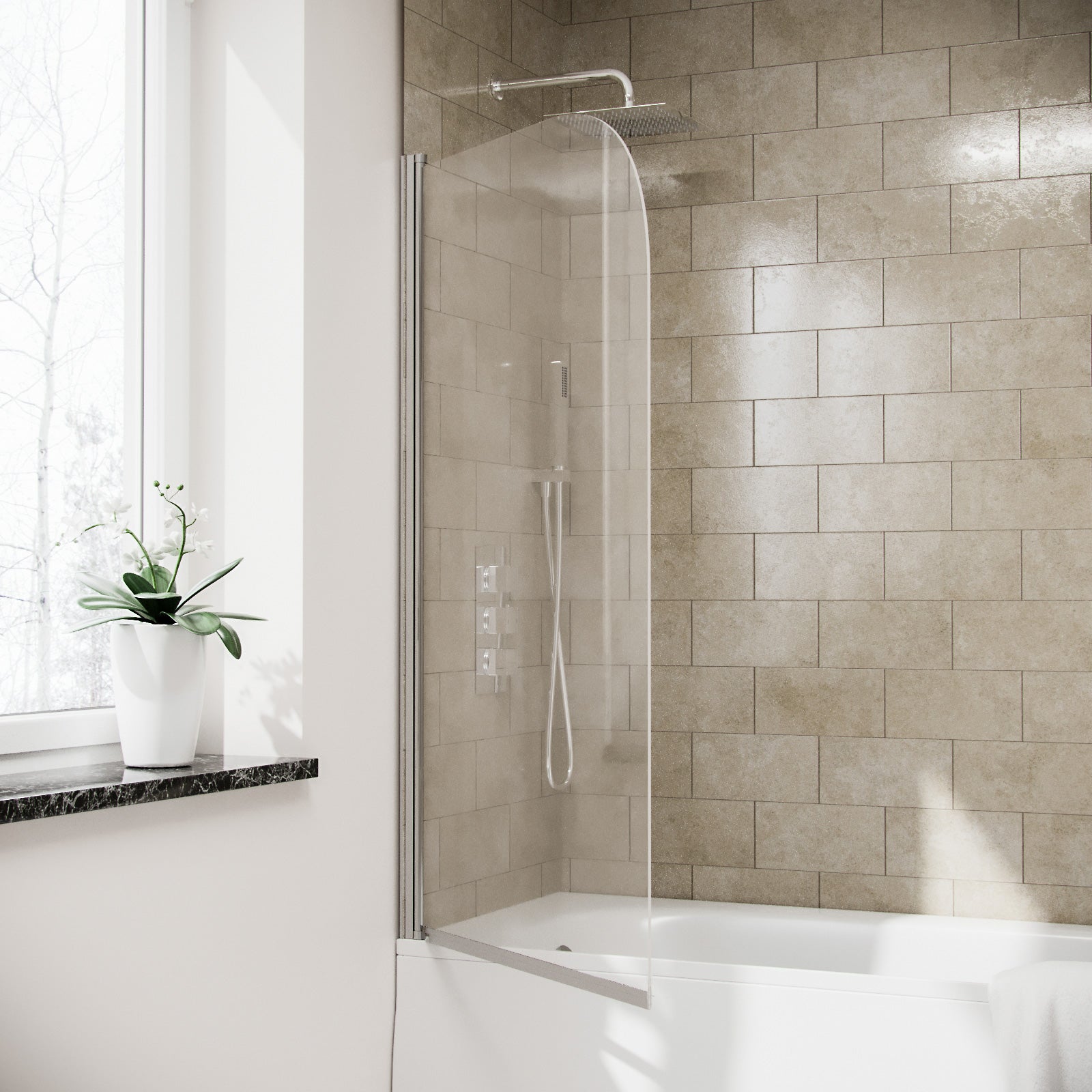
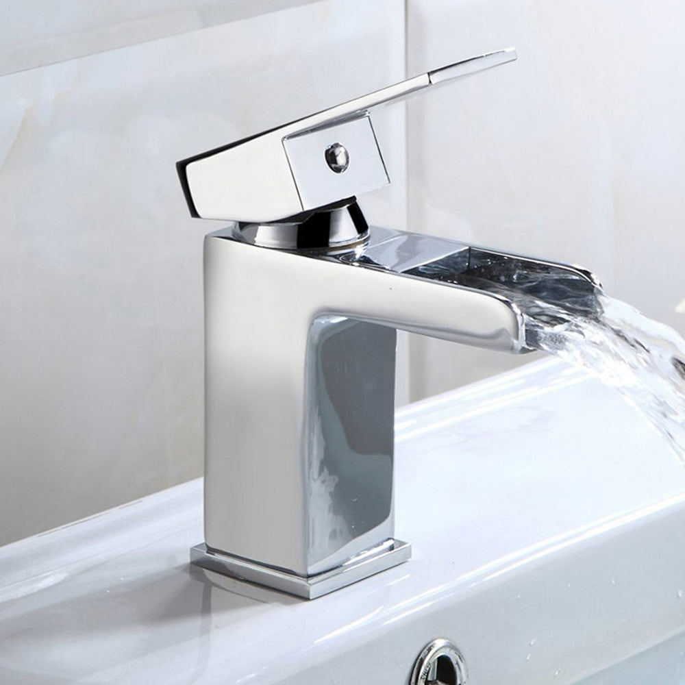
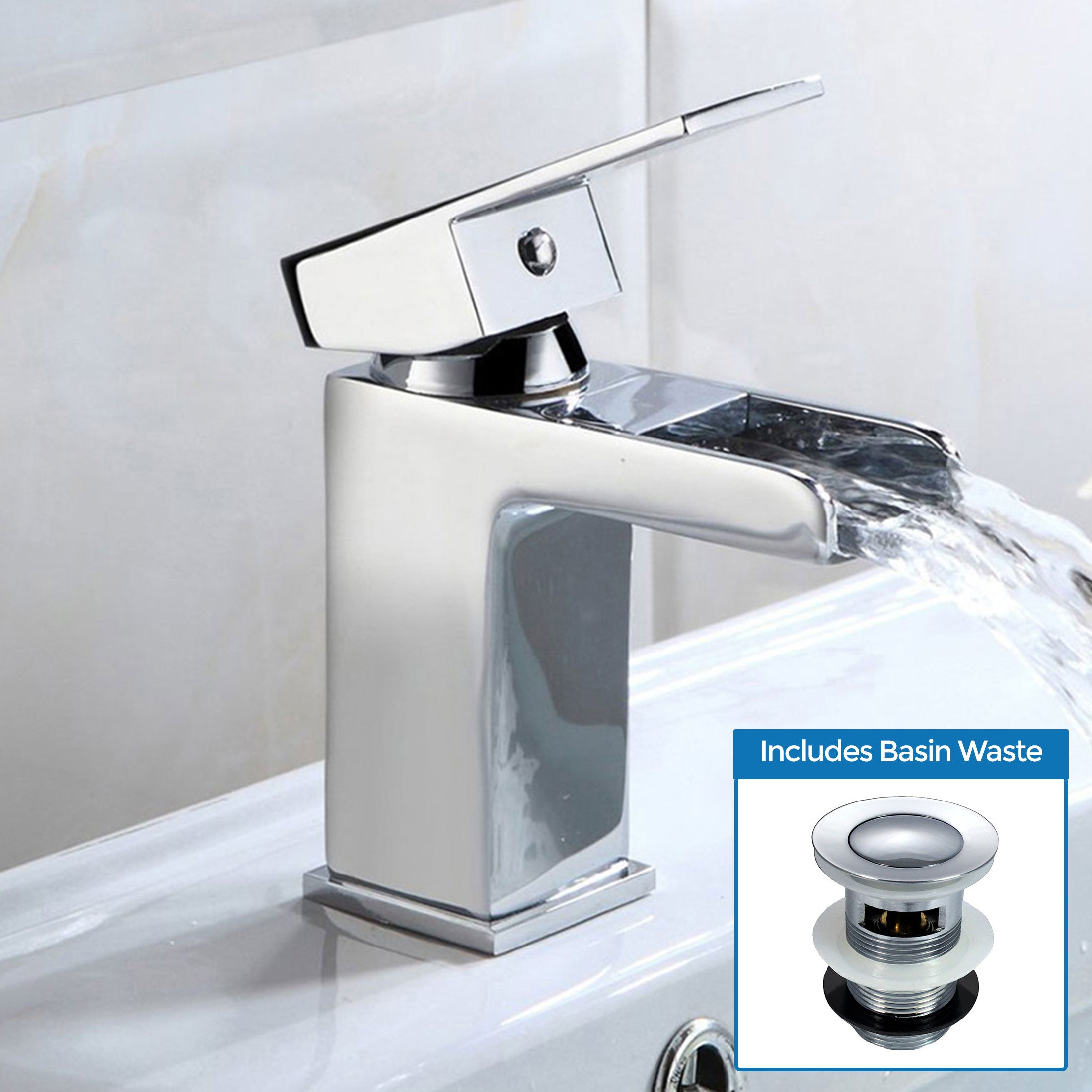
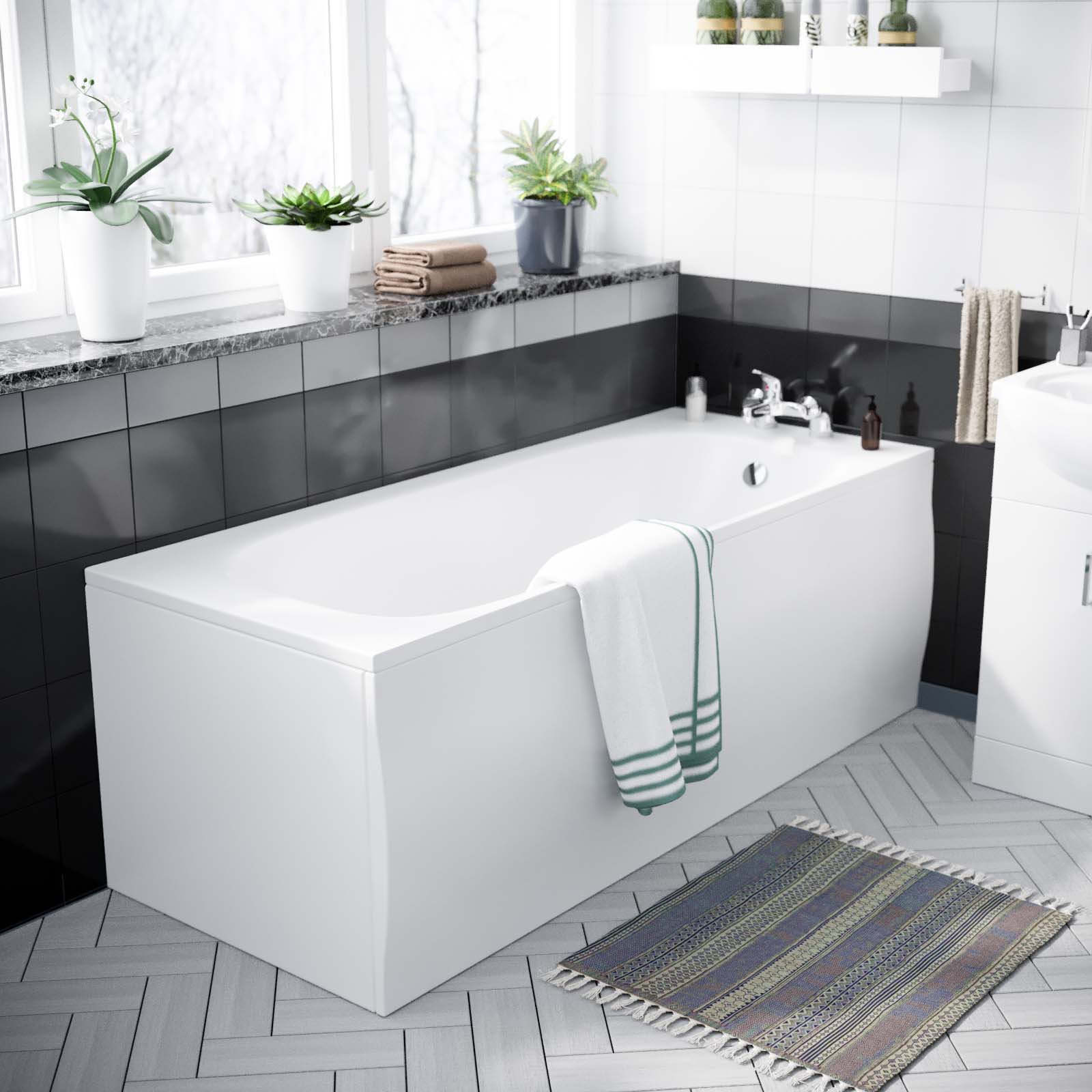
Chrome remains a timeless and versatile choice, offering a bright and reflective finish that complements a wide range of bathroom styles. While traditional polished chrome has been a staple for decades, the trend has shifted towards more modern interpretations, such as brushed chrome, which has a softer and more muted appearance. Additionally, it’s the most versatile colour, providing a clean and minimalist look that seamlessly blends with contemporary bathroom designs. These neutral tones of the chrome finish create a sense of calmness and serenity, allowing other design elements to take centre stage.

Matching Taps and Accessories with Bathroom Decor
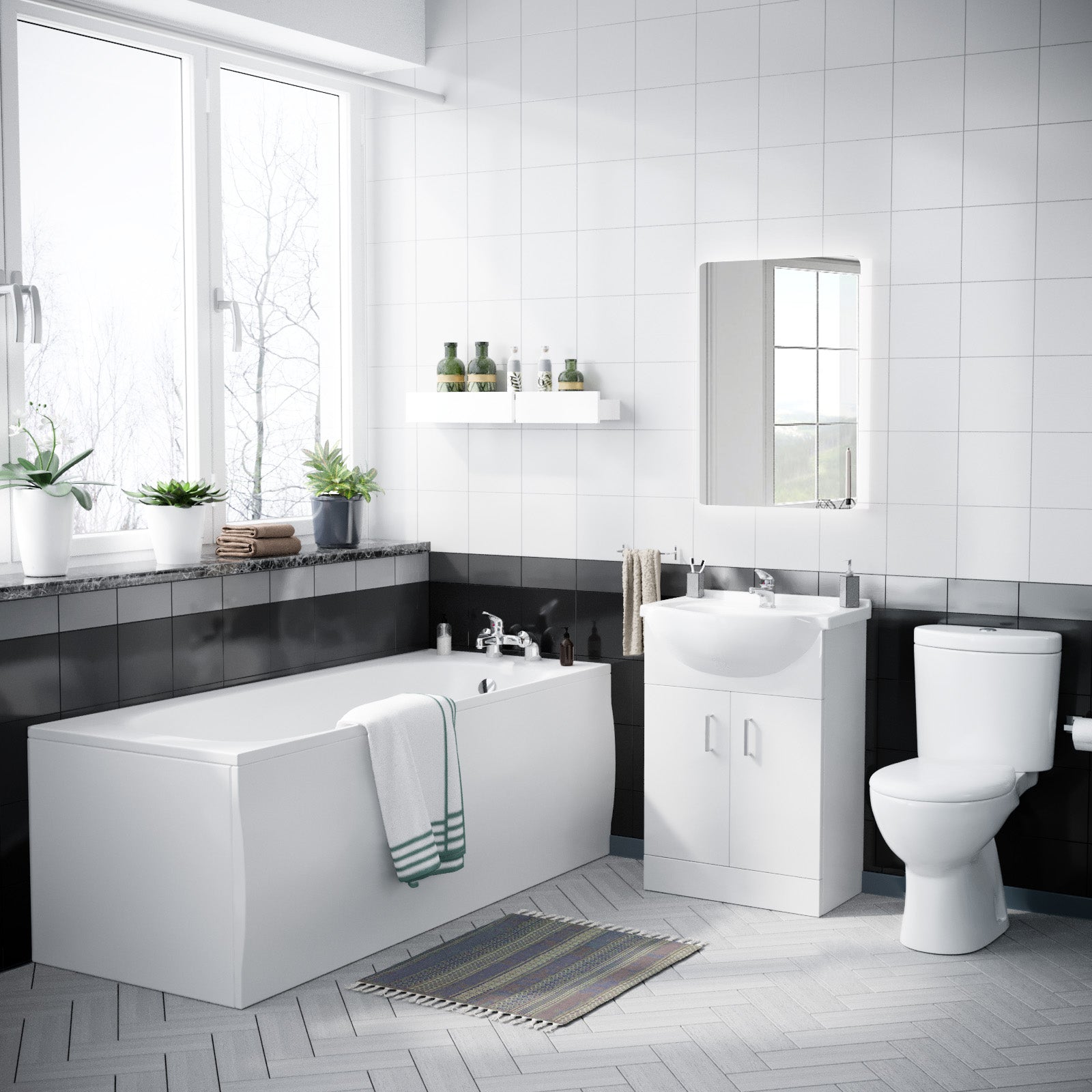
Creating a cohesive and visually appealing bathroom design often comes down to the details, and coordinating the colours of your taps and accessories with the overall colour scheme is crucial. Whether you're starting from scratch or working with an existing bathroom, thoughtfully matching these elements can tie the entire space together.
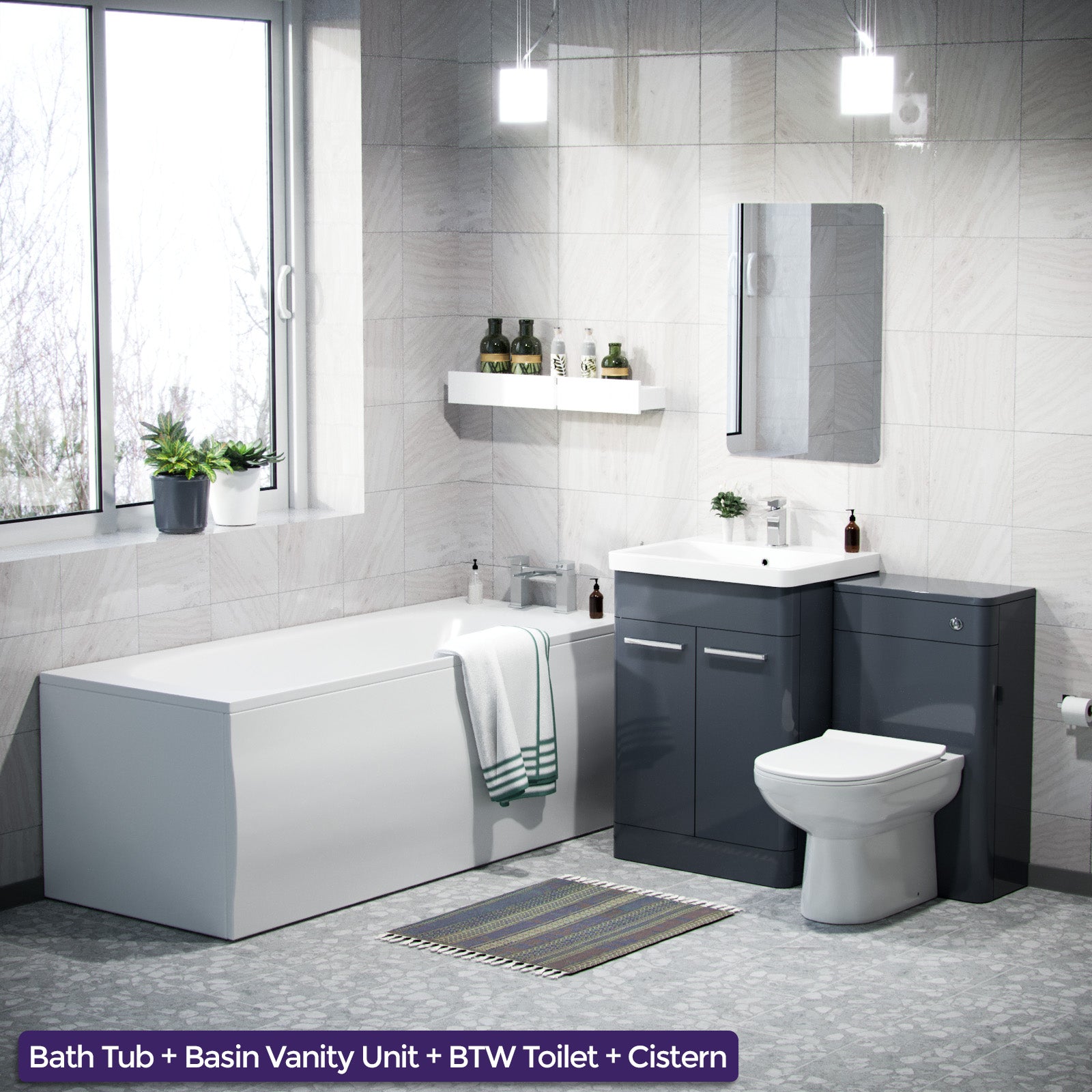
If you're working with an established bathroom colour palette, take cues from the dominant hues and patterns. For example, if your bathroom features warm, earthy tones like terracotta or sage green, consider taps and accessories in complementary metallic finishes like brushed or satin gold. Alternatively, if your bathroom has a cool, contemporary vibe with shades of grey and blue, sleek chrome or matte black fixtures can create a cohesive look.


Timeless Neutral Options
Neutral colours like chrome offer a timeless and versatile option for taps and bathroom accessories. These classic finishes can seamlessly complement a wide range of bathroom styles, from traditional to contemporary, and can easily adapt as trends evolve.
Chrome taps and accessories provide a sleek and modern look that can elevate the overall aesthetic of your bathroom. This finish reflects light beautifully, creating a bright and airy atmosphere. Chrome taps and accessories can effortlessly blend with various colour schemes, from neutral tones to bolder hues.


These neutral finishes are versatile and can be easily paired with various bathroom materials, such as tiles, countertops, and cabinetry. They can also be combined with pops of colour through towels, rugs, or other decorative accents, allowing you to create a cohesive and personalized look.
Bold and Vibrant Colour Choices
FIncorporating bold colours into your bathroom design can make a striking statement when done thoughtfully. Imagine a sleek, modern bathroom with clean lines and a minimalist style - a vibrant faucet or set of hardware can add a perfect pop of colour, preventing the space from feeling cold or overly sterile.


When selecting bold hues, it's essential to consider the overall colour scheme and ensure a cohesive look. Vibrant tones work best when balanced with neutral backdrops like white or opposing colour schemes, allowing the colourful elements to truly shine. Alternatively, complementary or analogous colour palettes can create a harmonious and visually appealing composition.


Ultimately, bold and vibrant colours for taps and accessories are a fearless choice for those seeking to make a statement and infuse their bathroom with personality and energy, these eye-catching pieces can elevate the entire space and create a truly unforgettable and stylish atmosphere.
Mixing and Matching Colours
Mixing and matching colours for taps and accessories can create a layered and eclectic look in your bathroom. While coordinating everything to a single colour can sometimes feel flat or monotonous, combining different hues adds depth, visual interest, and a touch of personality.


When mixing colours, it's best to start with a base colour palette of two or three shades that complement each other. These can be drawn from your bathroom's existing colour scheme or inspired by a favourite piece of art or textile. Once you have your base palette, you can introduce accent colours through taps, towel bars, robe hooks, and other accessories.
A popular approach is to choose a neutral base, such as white, grey, or beige, and then add pops of colour through metallic finishes or vibrant accents. For example, you could pair a chrome faucet with brushed brass gold towel bar and a colourful patterned shower curtain.
Alternatively, you could go bold with a deep blue or emerald green base and mix in warm metallics like gold or bronze for a rich, luxurious feel. Just be sure to balance the intensity of the colours and avoid overwhelming the space.
When mixing and matching, it's also important to consider the undertones of the colours you're combining. Cool tones like blues and greens tend to work well together, while warm tones like reds, oranges, and yellows create a cozier vibe. Mixing cool and warm tones can be tricky, but it can be done successfully by choosing colours with similar saturation levels and introducing neutrals to bridge the gap.
Remember, there are no hard and fast rules when it comes to mixing and matching colours in your bathroom. Trust your instincts, experiment with different combinations, and have fun creating a space that reflects your unique style and personality.
Coordinating with Tile and Countertop Colours
When selecting the colour of your taps and accessories, it's essential to consider the existing colours of your bathroom's permanent fixtures, such as tiles and countertops. These elements often serve as the foundation for the overall colour scheme and can significantly impact the cohesiveness of your bathroom's design.
If you have bold or patterned tiles, consider opting for a neutral or complementary colour for your taps and accessories. This approach will prevent the space from feeling too busy or overwhelming. Conversely, if your tiles and countertops are relatively neutral or monochromatic, you can introduce a pop of colour with your taps and accessories to add visual interest and personality to the space.
When coordinating colours, pay attention to the undertones of your tiles and countertops. Warm undertones, such as reds, oranges, and yellows, pair well with warm metallic finishes like brass or copper. Cool undertones, like blues and greys, complement cooler metallic finishes like chrome or nickel. Identifying and matching these undertones will create a harmonious and cohesive look.


Consistency Across the Bathroom
Achieving a cohesive and visually appealing bathroom design hinges on maintaining consistency in colour choices across all elements. From taps and faucets to towel racks, toilet paper holders, and other accessories, a harmonious colour palette can elevate the overall aesthetic and create a sense of unity.
When selecting colours for your taps and bathroom accessories, it's crucial to consider how they will complement or contrast with other fixtures and finishes in the space. A well-coordinated colour scheme can tie the entire room together, creating a seamless and intentional look that exudes sophistication and thoughtful design.
Remember, consistency extends beyond just the taps and accessories. Consider the colour of your vanity, mirror frames, lighting fixtures, and even small decorative elements like soap dishes or toothbrush holders. By carefully coordinating these elements, you can create a visually pleasing and cohesive environment that feels intentionally designed rather than haphazardly assembled.